
Port Royale 4, the latest entry in our trading simulation series, is coming to PS4 on September 25. We’re putting in a huge amount of work to make the Caribbean setting as beautiful as possible, so we thought we’d give you a behind-the-scenes look at how the key art has progressed from initial concepts to the finished visual.
The key art is the most important graphic for representing a game and will be used for online stores, cover art, social media and more. For many it’ll be their first impression of the game, so we have to get it right.

As you can see, the final piece features two sailing ships locked in a ferocious sea battle – pretty straightforward and obvious for a game like Port Royale 4, right? Well, maybe not. Getting to this point was a detailed process with some important questions:
1) Should we show a character, or a ship?
Whenever you start a new game in Port Royale 4, you will choose a character to suit your play style. There are two male and two female characters that each represent different ways of playing — so we thought it might make sense to use these characters for the cover design as well, as characters are more approachable and have more of a personal connection than ships.
If you look at the illustrations below, you can see how the characters evolved from rough sketches to coloured drawings and finally to full concept art:

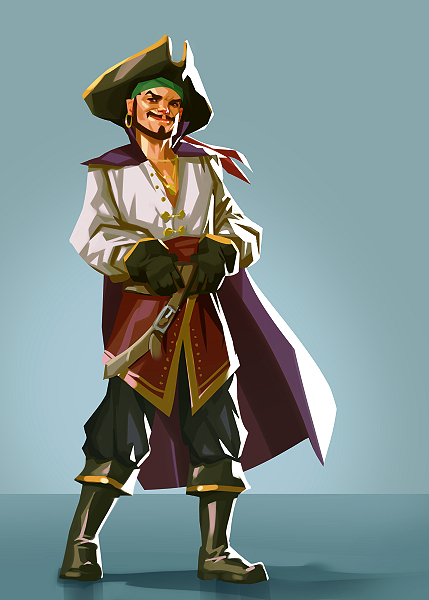


While I love the character work, the alternative to this would be to show a ship, which is a more crucial and prevalent gameplay element that potentially gives a better impression of the setting and era of the game.
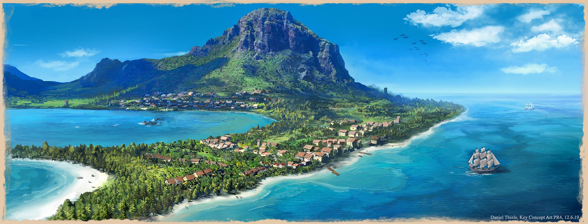
2) Should we show a quiet scene, or lots of action?
Port Royale 4 is by nature a pretty chill game where you spend a lot of your time buying and selling goods or planning trade routes, which led to this concept art:
However, sea battles are a core part of the gameplay too. Maybe your nation is at war with a rival, or you’re hunting for pirates – or er, maybe you have raised the black flag yourself. And since the key art represents the game at all points of sale – be it as a banner at PlayStation Store, or on the physical cover itself in stores, we decided that a graphic with a more action-packed scene might be more fitting.
3) What kind of colour scheme and lighting should we use?
Alongside the bright skies, crystal clear blue water and lush green islands of the concept above, we also wanted to see if scenes at dusk could work, with their warmer colours and gradients. It’s amazing what difference a variation in colour can have on the feel and mood of an otherwise (mostly) identical motif:

Fun fact! All the sketches and concepts of the characters I’ve shown you are in the final game, and even the ships are exactly the same as the 3D models you’ll be using when the game hits shelves in September. So we haven’t shown anything in the key art that you can’t also find in-game.
For the final key art, we decided to use two ships locked in a naval battle at dusk. If you take another look at the concept art above, you’ll see that none of them exactly matches this final result. Instead, we took the idea of having the two ships from concepts 1 and 2 but had them facing different directions. We then went with the colour scheme of concept 5.
By showing two ships, we were able to show the contrast of a pirate ship and one serving a nation, representing another core game mechanic, while the warm, dusky sunlight and action-packed scene give a more striking visual impact — hopefully catching the eye of anyone that sees it.
We hope that this article has given you an idea of the importance of the key art, the creative process and how we got from a set of very different ideas to the final graphic. You’ll be able to see the final piece at PlayStation Store and box art very soon, when Port Royale 4 releases on September 25. See you on deck!
Subscribe to our mailing list
Get the latest game reviews, news, features, and more straight to your inbox


